How To Write An SEO Optimized Blog Post in WordPress

“If the content is the King, we can say SEO is the Queen.
We have already brought you a lot of articles on SEO to help you optimize your blog and make it search engine friendly so you can increase your traffic and your sales. Today I will talk about WordPress SEO Optimization, being that it’s the most used platform by self hosted blogs.
They say that WordPress is SEO Optimized which is the reason they use it, but it’s not fully SEO Optimized and so to reach the 100% you have to put in a little hard work apart from all the plug-ins we suggested already.
Its pretty easy to submit your blog or website to the search engines by just copying your sitemap’s URL and hitting the next buttons for their submission process. But in order to make the search engines pick your new posts and inject them into their site’s data we need to optimize our posts, just as we optimize our blog. It includes the keywords, that we use in our blog or website’s header as well as the Titles and the Tags.
So in order to write a perfectly SEO optimized blog post, we need to think about it just as a web page and use some, or all, of my tips below. We will focus mainly on WordPress, for it is pretty easy to optimize for the search engines.”
Responsive Design: How To Use CSS3 Flex Box

“CSS offers several tools to help with site layout. Over the years we’ve worked mainly with floats, positioning, and margins, but let’s face it, most of us would like more. Fortunately css3 is giving us more tools for layouts. One of those tools is the flexible box.
A couple of weeks ago .net magazine published an article on The future of css layouts, in which they covered several new css3 layout modules. I’d like to work through some of them starting today with the flexible box layout module.
I’ve created a demo page illustrating some of the properties of the flexbox, though there’s not much to see in the demo that you can’t see from the images throughout this post. It’s there in case you want to play around with the source code.”
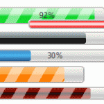
How to Create Graphical File Upload Progress Bars Using HTML5 and JavaScript

“In my previous posts, we discovered How to Use HTML5 File Drag & Drop, Open Files Using JavaScript and Asynchronously Upload Files Using Ajax. In the final part of this series, we cover the most exciting part of the process: graphical progress bars!
File upload progress bars provide essential user feedback but they’ve been notoriously difficult to implement. Until now that is. Both Firefox and Chrome support the XMLHttpRequest2 object which offers a progress event handler. But first, let’s consider how our progress bar will be implemented…”
5 Reasons to Optimize Your Site for Mobile

“It seems like the whole world has a smartphone these days. As of December 2010, a reported 31% of all US mobile phones were smartphones.
That means there’s likely to be a LOT of people viewing your website on a mobile device. Do you know what kind of experience those people have on your site? Does your site have a dedicated mobile version?
Here’s 5 reasons why we think it should.”
Tutorial: Getting Started With jQuery Animations

“jQuery. No doubt you have heard about this popular JavaScript library. It has taken the throne of all the JavaScript libraries out there because of its many features and easy syntax. Today, I will show you one of the simpler uses of jQuery: you can animate things. this will be the focus of today’s tutorial.
Before we begin, you should learn one very important thing: this next snippet of code.”
What is Responsive Web Design And How Can I Use It?

“Almost every new client these days wants a mobile version of their website. It’s practically essential after all: one design for the BlackBerry, another for the iPhone, the iPad, netbook, Kindle and all screen resolutions must be compatible, too. In the next five years, we’ll likely need to design for a number of additional inventions. When will the madness stop? It won’t, of course.
In the field of Web design and development, we’re quickly getting to the point of being unable to keep up with the endless new resolutions and devices. For many websites, creating a website version for each resolution and new device would be impossible, or at least impractical. Should we just suffer the consequences of losing visitors from one device, for the benefit of gaining visitors from another? Or is there another option?
Responsive Web design is the approach that suggests that design and development should respond to the user’s behavior and environment based on screen size, platform and orientation. The practice consists of a mix of flexible grids and layouts, images and an intelligent use of CSS media queries. As the user switches from their laptop to iPad, the website should automatically switch to accommodate for resolution, image size and scripting abilities. In other words, the website should have the technology to automatically respond to the user’s preferences. This would eliminate the need for a different design and development phase for each new gadget on the market.”
Real World CSS Practices

“By now, I think it’s safe to say that most designers on the web are using CSS in some capacity. Even those (misguided) individuals who are still using table-based layouts have a tendency to use CSS for some basic styling, such as establishing fonts and link colours. With that in mind, I thought it might be worthwhile cover some of what I have found to be best practices.
Before getting started, it’s important to note that these are practices and habits that I have developed based on my own experience, which includes developing different sites, my own experiments and reading from a variety of sources. While I have my own reasons for the way I do things, I am in no way presenting the following as CSS gospel that absolutely needs to be followed.
As with anything, take what you read, weigh it against your own knowledge, values and experience in order to formulate your own methodology.”
Why Users Fill Out Forms Faster with Top Aligned Labels

“Imagine a user who is really excited about your product or service. They’re ready to sign up, so they go to your form page and start filling out their information. The way you align your labels with your form fields can affect how easy it is for users to fill out the form. Do you want to give users a quick, easy and painless experience or do you want to give them a hassle? If you want to make their experience quick, easy and painless, consider using top aligned labels for your form fields.”
Extending the Functionality of WordPress (Part 2)

“Previously, we brought you a handful of ways to expand on the functionality of any WordPress based site using some inspired plugins and/or themes to elevate this CMS beyond its humble beginnings as a blogging platform. With ways to turn WP into a Discussion Forum, an Online Shop, and a Helpdesk. Today, that mission continues.
Excerpt from Part One
Theme designers and plugin developers have been pushing the boundaries of what WordPress can do for some time. This has accelerated since the introduction of Custom Post Types into the WordPress core as it allows developers to use WordPress in a lot of weird and wonderful ways.
Today we will begin showing you examples of themes and plugins that let you use WordPress in ways you may have never thought possible.
As we mentioned last week, in this installment we will show you how to extend the possibilities of your WP site to make it a Wiki, an Arcade, a Job Board, a Membership based site, a Review site, or just a Q&A site. Now let’s get at it.”


